Which Design System Has the Best Color Palette?
Chromametry's five-metric framework applied to 11 production design systems. No opinions — just contrast spans, density ratios, perceptual curves, and the composite score.
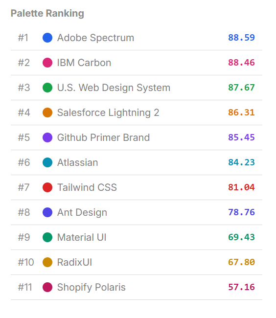
The Full Table
| Design System | Ramps | Steps | K | η | L | Sc | H | U | Score |
|---|---|---|---|---|---|---|---|---|---|
| Adobe Spectrum | 10 | 18 | 9 | 0.943 | 0.933 | 0.879 | 0.914 | 0.772 | 88.59 |
| IBM Carbon | 12 | 12 | 6 | 0.911 | 0.930 | 0.869 | 0.929 | 0.792 | 88.46 |
| U.S. Web Design System | 25 | 12 | 6 | 0.911 | 0.936 | 0.810 | 0.938 | 0.800 | 87.67 |
| Salesforce Lightning | 13 | 14 | 7 | 0.925 | 0.919 | 0.846 | 0.937 | 0.711 | 86.31 |
| GitHub Primer | 13 | 12 | 6 | 0.911 | 0.924 | 0.841 | 0.941 | 0.684 | 85.45 |
| Atlassian | 9 | 14 | 8 | 0.771 | 0.896 | 0.909 | 0.947 | 0.713 | 84.23 |
| Tailwind CSS | 18 | 13 | 8 | 0.756 | 0.871 | 0.857 | 0.915 | 0.678 | 81.04 |
| Ant Design | 12 | 12 | 9 | 0.665 | 0.859 | 0.873 | 0.928 | 0.655 | 78.76 |
| Material UI v4 | 19 | 12 | 11 | 0.507 | 0.797 | 0.786 | 0.924 | 0.550 | 69.43 |
| Radix UI | 16 | 13 | 10 | 0.474 | 0.798 | 0.768 | 0.947 | 0.521 | 67.80 |
| Shopify Polaris | 12 | 17 | 15 | 0.282 | 0.728 | 0.689 | 0.922 | 0.467 | 57.16 |
Per-system audits with every ramp: Adobe Spectrum · IBM Carbon · USWDS · Salesforce Lightning · GitHub Primer · Atlassian · Tailwind CSS · Ant Design · Material UI · Radix UI · Shopify Polaris.
K = contrast span. η = contrast efficiency. L = lightness linearity. Sc = chroma smoothness. H = hue stability. U = spacing uniformity.
Three Groups
High (Score > 85): IBM Carbon, Adobe Spectrum, USWDS, Salesforce, GitHub
What they share: K is small relative to N. IBM Carbon uses 12 steps with K=6 — exactly half. Adobe Spectrum uses 18 steps with K=9 — exactly half. This is not a coincidence.
When K ≈ (N−1)/2, every shade in the palette can serve as a background and always has a text color at distance K satisfying WCAG 4.5:1 — in both directions. The full palette is accessible. Nothing is wasted.
These systems also score consistently across all five metrics — no single weak dimension dragging down the geometric mean.
Medium (75–85): Atlassian, Tailwind, Ant Design
K has grown relative to N. Tailwind uses 13 steps with K=8 — 61% of the range consumed by one contrast requirement. Ant Design uses 12 steps with K=9 — 82% consumed.
Chroma smoothness is relatively high in this group (Atlassian 0.909, Ant Design 0.873), suggesting the curves are well-shaped. The drag is contrast efficiency — the palettes are less dense, leaving fewer shades free for secondary roles.
Low (< 75): Material UI, Radix UI, Shopify Polaris
Contrast efficiency collapses. Shopify's K=15 in a 17-step palette means 93% of the range is consumed by a single WCAG requirement. The palette is nearly unusable as a design system — almost every pair needs to span almost the entire ramp to achieve readable contrast.
Spacing uniformity is also low in this group (Shopify 0.467, Radix 0.521). Non-uniform step spacing means some adjacent shades are nearly identical and others jump sharply.
What the Numbers Show
Hue stability (H) is consistently high across all 11 systems — ranging from 0.914 to 0.947. This suggests it's the easiest dimension to get right, or that hue consistency is a natural byproduct of standard generation methods.
The differentiating metrics are contrast efficiency and spacing uniformity. These are the two axes where design systems diverge most — and both relate to how the lightness range is distributed across steps.
Bootstrap, Google Material 3, Apple HIG, and Fluent UI are excluded: they define discrete semantic tokens rather than algorithmically constructed sequential ramps, and the framework requires continuous ramp structure to compute.
View Each System's Full Report
Click any system to open its full report — metric breakdowns per ramp, lightness/chroma/hue charts, cumulative ΔE curve.